Thursday, 5 November 2026

Coronation decoration - Harold Nelson's borders for The Ladies' Field - June 1902

Harold Nelson's designs for the Coronation of Edward VII in 1902

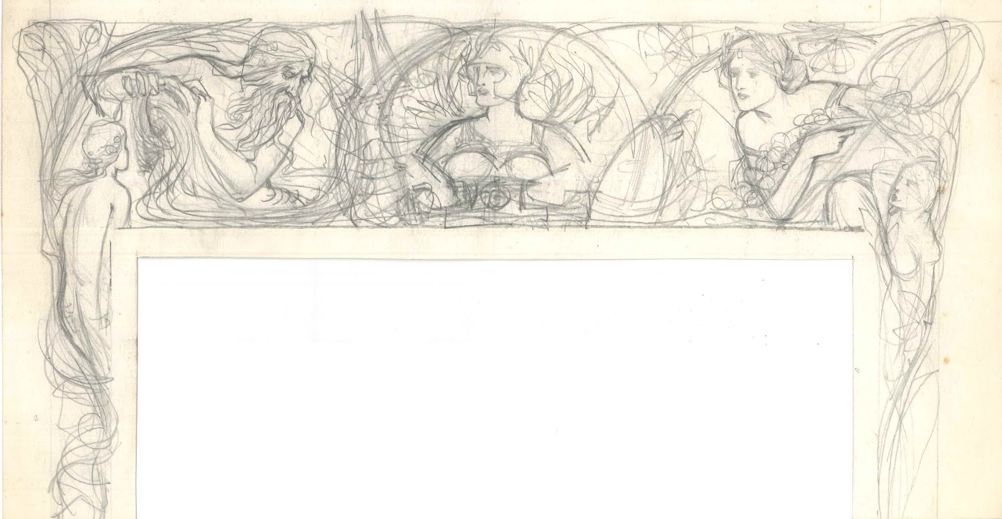
One of my favourite drawings in my collection features Poseiden, Athena and Flora. Poseiden pours water from a jar, Athena holds a trident (Poseiden's) in the centre and Flora holds flowers and fruit. It is a preparatory drawing for a page border.

For quite some time I have speculated what it may have been for. After looking through copies of The Ladies' Field I discovered that the drawing was a preparatory design for one of their special issues.

An advertisement in the Ladies' Field of 31 May 1902 hinted at some work of Nelson's which I had not come across before. Pages of the Coronation number had been designed by Nelson.

Advertisement for The Ladies' Field Coronation Number 31 May 1902


My page border drawing featured in the Coronation Number published on June 14 1902. In total Nelson designed the back cover and two borders which were printed in different colours throughout the volume.

Preparatory Sketch, 1902.


Printed version cut down to match the drawing.

There were slight adjustments including the location of Poseiden's trident, whilst the vines dividing the gods have been further elaborated. Poseiden is flanked by mermaids and Flora by nymphs.

Full page image of the border page 49.


Second Border, 1902.

The second, named as such, as it is the second border by Nelson to appear in the Coronation number. The border features two muses attending to the royal lions, the muse to the top right holds a sceptre and to the left, the other holds out the crown in an act of coronation. 

Muse holding a sceptre to the regal lion (detail).

Muse offering a crown to the regal lion (detail).

The back cover of the issue features a winged victory holding a crown and sceptre, standing above figures representing 'East and West' thereby uniting the Commonwealth. West sits with a kangaroo and East, a cheetah / leopard.


I would love to know if Nelson had specific instructions what to include in his designs for this edition or whether he was able to choose himself. Hopefully I will be able to find more about this incredibly beautiful drawing soon enough.


Friday, 14 February 2025

Harold Nelson and the Ladies' Field - Masks and Faces

There are many columns that Nelson created decorative headings for and one of the first I was aware of was Masks and Faces...

This was a weekly column that included details and gossip about actors in professional theatre productions as opposed to the pieces dedicated to amateur theatre. 

Nelson designed a Renaissance style figure (actor?) and some classical style masks with the usual scroll announcing the title of the column. The figure is in the centre looking proudly toward the masks that he may well wear in his performance.

A sketch survives for the masks... which appear to be very similar to the final design albeit moved to the left, separated from the text. Originally Nelson conceived that the masks of Comedy and Tragedy would inhabit the whole design, although probably in the end deciding that this was too complicated and would not translate well to a wider page.

Harold Nelson, Masks and Faces (a sketch for the decorative heading for The Ladies' Field), about 1898.

Harold Nelson, Masks and Faces (final design printed in the Ladies' Field Magazine), November 1899.


The finished design is more interesting and fits better in the large page format of the magazine. It's also interesting as it is one of few designs that I come across that Nelson made for The Ladies' Field featuring a man on their own. Other designs for the magazine feature men and women or women on their own.
Of course I will be posting more in the future.
If you enjoy this please do check out my Instagram page devoted to Harold Nelson - @haroldnelson_artist 


Monday, 10 February 2025

Harold Nelson and The Ladies' Field Magazine

Harold Nelson was not just a bookplate artist or designer of stamps which is what he is mostly remembered for today. Nelson also produced illustrations for many magazines during the late nineteenth and early twentieth centuries.

One such publication was an early forerunner of Vogue, The Ladies’ Field. First published in 1898 as a weekly magazine for women, it came out on Saturdays from March 1898 to March 1922. It focused on many subjects of interest for the Victorian woman including sports, art, books, pets, fashion and many other things.

Nelson created many images for this publication between 1898 and at least 1910.

What will follow (in the coming weeks) are a selection of images, either designs drawn, printed decorative headings or covers, for the magazine. 

Harold Nelson, The Ladies' Field, 1898.


Let’s start with the logo for the magazine which regularly appeared on the introductory page behind the cover. An elegant Victorian woman holding flowers, wearing a coat emblazoned with lion rampant. Fleur de lys decorate the background with the scroll drawn over the background decoration. 

The woman is most definitely elegance personified and a perfect image for the magazine, perhaps even the ideal reader.


Tuesday, 1 August 2023


A Memorial to Emily Jane Morley

I think I have neglected this entry for long enough and it's about time that I start putting more of my work out there for people to read (if they wish).

One of the long serving members of staff at BSA was the needlework teacher, Emily Jane Morley. Morley was born on 27 November 1860, and her family home was in Rokeby Road in Brockley.[1] She appears as the needlework teacher in the BSA adverts in the Woolwich Gazette, offering classes on Tuesday mornings between 10.30am and 12.30pm and Thursday afternoons from 3pm to 4.30pm.[2]
Unfortunately I am yet to find an example of her work although judging from the reports of student works she was a highly respected teacher. Examples of comments over the year include the following:
1914 - ‘Arranged in the upper studio of the new wing may be seen numerous exquisite pieces of Art Needlework done by the pupils of Miss E.J. Morley.’[3]
1921 – ‘In the needlework section, where the quality of work has always been excellent…’[4]
1923 – 6 October 1923 – students’ exhibition review
The 1921 prospectus described Art Needlework classes as follows (it was at this time a subject studied only by women) –
‘Students are taught the various Stitches etc., which belong to Embroidery, Drawn Thread and Lace Work, also the application to various articles of daily use and ladies’ apparel’.[5]
Morley lived at 11 Lee Park, very close to BSA, with her assistant and companion Lilian Booth. Emily Morley died on 10 June 1925 and whilst I have not yet found any illustrations of her works there is still a memorial in Blackheath that relates to her. Morley’s funeral was held on Monday 15 June 1925 at St Michael and All Angels in Blackheath and the internment at Nunhead Cemetery.[6] One of the principal mourners was her companion and assistant Lilian Booth. Morley was a very highly regarded member of the teaching staff at BSA, the school was closed on the day of her funeral as a measure of respect.[7] The principal, John Howard Hale, the secretary EP Lewis and the registrar Mrs Dowling represented the school as well as many students of BSA both past and present. The principal and committee of BSA presented a wreath in the ‘form of a chaplet’ and her colleagues and students presented a wreath in the form of a palette.[8]


Memorial to Emily Jane Morley carved by BSA students, St Michael's, Blackheath.
Source: Thanks to St Michael's Blackheath for allowing me to photograph and publish this image.

The memorial to her was to be unveiled on 16 June 1927 at 6pm in St Michael’s, Blackheath.[9] This wood carved epitaph was created by students at BSA. Woodworking students were taught by Mr F Parrott. From the descriptions provided in the contemporary prospectuses I believe that the students who produced the beautifully carved memorial were studying under Parrott as the lettering classes do not refer to the use of carving as part of the students’ learning.
I hope at some point to discover some needlework made by Morley but until then this memorial remains a tangible memory of her work at BSA.


[1] She was baptised on 23 December 1860, and the family home was at 13 Rokeby Road, Brockley and her father Alfred was a stationer.
[2] ‘Government School of Art’, in Woolwich Gazette, Fri 10 Jun 1898, p. 4 and Fri 16 Mar 1900, p. 4.
[3] ‘Blackheath School of Art: Exhibition of Students’ Works’ in Blackheath Local Guide, 26 September 1914, p. 8.
[4] ‘Blackheath School of Art: Student Exhibition’ in Blackheath Local Guide, 21 October 1921, p. 37.
[5] Blackheath, Lee, Lewisham & Greenwich School of Arts and Crafts Prospectus, 1920 – 1921, p. 14. Morley taught classes during the day Tue 10am to 1pm and 2.30pm to 4.30pm, Thu 2.30pm to 4.30pm and Fri 10.30am to 12.30pm, and in the evening Mon 6.30pm to 8.30pm and Tues to Thu 7pm to 9pm.
[6] ‘Funeral of Miss Morley’, in Blackheath Local Guide, 25 June, p. 36.
[7] Ibid.
[8] Loc. cit. pp. 36 & 37.
[9] ‘St Michael’s, Blackheath Park’, in Blackheath Local Guide, 11 Jun 1927, p. 6. The unveiling was in conjunction with a day dedicated to missionary work in China undertaken by members of the congregation.

Thursday, 6 April 2023

Would you have these two over to dinner?


Humour and wit in the art of Alfred de Sauty…

Alfred de Sauty, Coming Over, early 1930's.

I recently acquired this print by Alfred de Sauty entitled ‘Coming Over’ and it reminded me that I had been meaning to write a piece about his humorous side.

 These two are obviously on the way over to a neighbour’s house for dinner. Are they providing the food or is the way so treacherous that they need a gun to ensure that they make it there safely!? Either way it’s a witty comment on the nature of community in the wilds of the US. The print is dedicated to ‘Mr and Mrs RP Brown from A De Sauty’ – could the couple perhaps have inspired De Sauty? I guess it may never be possible to discover this, although it is fun to speculate.


Alfred de Sauty, The Proposal, 1930's.

Alfred de Sauty, Matrimony, 1930's.

Alfred de Sauty, Divorce, 1930's

Alfred de Sauty, The Proposal, Matrimony and Divorce, 1930's.

During lockdown I was emailed these three intriguing images which join to form a series. It’s s satirical comment on the nature of business deals. It may well relate to the cut throat nature of the way of doing business, a kind of brashness that De Sauty would not have experienced first-hand before he went to Chicago in Autumn 1923. I would date this work from the early to the mid-1920’s, not long after he moved across the Atlantic. It matches the style of works he produced whilst still in the UK.

De Sauty produced three prints entitled The Proposal, Matrimony and Divorce, and have only just got back to looking at them (where does the time go?). These three works are related to business deals in America under 'marriage' related titles. Looking closely at 'Divorce' the money sacks have $ signs on them which confirms to me it is most likely a comment on business deals in America.


Alfred de Sauty, Floreat Chicago, 1935 or earlier, Smithsonian Museum.

They are quite similar in style to his brilliant depictions of the growing metropolis of Chicago which date to the mid 1930’s – about 10 years after his arrival in the US.

Could the businessman be a self-portrait (or a portrait of someone in particular)? The figure holding the gun (a man in a woman's dress) might be representative of a forced marriage / business deal at gunpoint. The businessman appears to be giving up everything to get the deal (even though he is at gun point). Of course, the woman isn't what she seems to be for the rather unusual gunpoint proposal and is depicted wearing high heels as part of the deceit. In the other two (Matrimony and Divorce) he / she is now wearing boots; perhaps revealing their true character.

The businessman is chained to the man / woman holding his goods (designs?) under his arm in Matrimony. Once the sinister the figure has got what they wanted (bags of dollars) they then divorce / break the deal with the businessman by kicking him away.

This could well be a comment on him finishing work at RR Donnelly & Sons (Lakeside Press) in Chicago but cannot be sure as there is very little known about De Sauty's personal life.


Rockwell Kent & Alfred de Sauty, De Sauty's Bad Dream, My Yours be Better, 1931.
More can be found about it through Underhill Books - here


De Sauty also worked closely with Rockwell Kent - and there is a piece signed by both De Sauty and Kent which makes me think that he had a rather wicked sense of humour (see above). Kent illustrated Moby Dick and De Sauty worked with Kent at the Lakeside Press binding his illustrated books (esp. N by E in 1930). The drawing shows various characters riding on and attacking Moby Dick and is a new year’s wish for the year ending 1930 and beginning 1931. Are the characters on the whale a part of De Sauty’s nightmare? ‘The piece is inscribed ‘De Sauty’s Bad Dream May Yours be better in 1931.’

Certainly, the seemingly brash world of American business deals and contracts at this time must have been something completely different to De Sauty's experiences in London. It must have affected him and inspired these fantastic images.


Saturday, 22 May 2021

Harold Nelson and depictions of Athena


Harold Nelson and depictions of Athena

Happy 150th birthday to Harold Nelson who was born on this day – 22 May – in 1871.

It’s been a while since I have added something to the blog and thought that it was about time that I got around to doing so. Nelson was best known in his lifetime as a black and white illustrator and ex-libris designer for wealthy clients and organizations.

One of my questions about his working method was whether he re-used image or had a design book that potential patrons could choose what they would like for their personalized ex-libris. He did indeed re-use images which I will delve into further detail at a later date. I have decided on this occasion to focus on his images of Athena, the goddess of wisdom and the arts, she was the counsel of Odysseus during his Odyssey. At the time of the French Revolution Athena began to stand for Freedom and Liberty.

Nelson depicted Athena a number of times through his career and must have been interested in depicting her as she had become seen as the Goddess of the Arts. I have included some examples below from sketches, design drawings and finally to ex libris bookplates.


This exquisite drawing features Athena in the centre flanked by water nymphs. I am not entirely sure whether this was later developed into a finished image.


Design drawing for the Strand Magazine. Here Athena, in armour ready for battle, is depicted to the right of the drawing. Below Athena is written ‘Fact’ an allusion that she stands for wisdom and knowledge. I am unsure whether this design was ever used in print.


A sketch for Athena (most likely to have made for an ex-libris design for a library or book collector), depicted holding a book and a spear. Behind her are the leaves of the olive tree.


This image of Athena with her sword and lantern was also used by Nelson for the National Union of Teachers. Athena is entwined in an olive tree, representative of the one that grew on the Acropolis. The scroll behind Athena has ‘Vince Fide’ (Conquer with Faith) inscribed on it.


Here is the above image used as the logo for The National Union of Teachers. The main discernible difference is the inscription on the scroll. As they are undated I am not entirely sure which came first.


This is such an appropriate representation of Athena for the Bedford College Library. Here she is within an olive tree with an owl on her right shoulder and a lantern in her left hand. Books, source of knowledge, are scattered at the bottom of the ex-libris.


This is a more serious stoic representation of Athena for a potential ex-libris patron as there is no name included in the design (it is included in Nelson’s 1929 volume of bookplates). Athena holds a shield and spear, standing in front of classical architecture (the Acropolis?) and an owl appears in an olive branch in front of the goddess.


As these images are all from my own collection, I am sure there must be other variations in existence from Nelson’s career. Hopefully I can add other images as I discover them. His works are quite accessible and a good way to get into black and white illustration in late nineteenth and early twentieth century Britain.


Thursday, 26 March 2020

A constant across the seasons...

A constant across the seasons...

Over the past few years I have commuted to work through Greenwich Park. On the way to work I have often focused on an oak tree in the park which I found to be a stoic / monumental constant. I have always been meaning to do something with the photos I have taken of the tree and the effect changing of the changing of the seasons on it. The tree has always been an unchanging fixture with the environment around it in flux. This is everything from the sky, to the light around and the shadows cast by the tree and the colour of the grass. 

I was hoping to make this visual record as one image per month to produce a year of images albeit across a few years. What I found was there were some months like February where the atmospheric surrounds of the tree were simply stunning. I have limited myself to two images per month and also discovered that during the summer I wasn't as frequently photographing the park.

I must admit that this was finally prompted by the interesting exhibition Among the Trees which opened recently at the Hayward Gallery I wasn't entirely taken by all of the pieces in the show but it certainly made me think about trees and their place in the world.

Anyway here goes - hope you enjoy...


January 2018


January 2019


February 2019


February 2019


March 2018


March 2017

April 2019


April 2018


May 2018


May 2018


June 2017


July 2018


August 2018


September 2018


October 2019


November 2017


November 2017


December 2017

December 2017